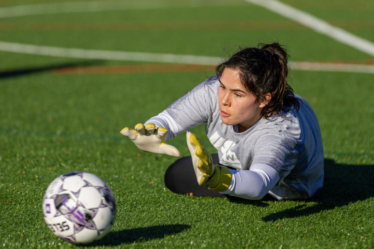

A new soccer team takes Richmond by storm after 14 years without a women’s pre-professional team. Starting in summer 2024, Richmond Ivy Soccer Club will welcome female athletes who aspire to become next-level players. With an innovative game plan, crest and team name that speaks to the town’s history of soccer enthusiasts, as well as its historic nature, the team is set up for success.
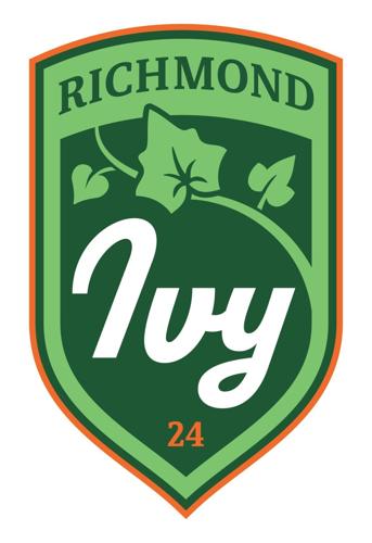
“The name ‘Ivy’ came from a list of over 200-plus names that we as a team developed,” said Alex Kocher, the designer and art director for the Richmond Ivy Soccer Club, who worked on the team’s branding. “We looked through four different territories or scenes, and picked Ivy because it’s connected to the outdoors, the city’s history and its urban landscape.”
The plant ivy has inspirational characteristics that really drove home the decision. Its winding vines that endlessly seek higher altitudes aligned with the aspirations of the team.
“It has some tenacity to it in the way that it overcomes obstacles and climbs up fences and trees,” said Kocher. “We really liked that as part of the ethos — especially with this being a semi-professional team, an opportunity for young women to develop their game and reach the next level of professional soccer.”

Kocher helped devise the team’s logo — a vine of ivy that begins on the crest’s bottom right side and moves toward the top left, overtaking a portion of the crest’s prominent shield — the idea of striving for greatness and climbing ever higher embodied.
The club’s colors were also chosen meticulously: a dark “Richmond” green as the base hue, a yellowish “ivy” green for the more intricate details and a bright brick orange as the accent to represent the historic homes in town. Although incorporated as a tint mostly at the border of the crest, the vibrant orange was chosen specifically as the border of the crest to highlight the founding year, 2024, a truly vital aspect of the crest and the club’s identity.

“At the bottom of the crest is ’24, an important number for the team to incorporate into the mark because it’s the founding year, and it’s the stake in the ground, if you will,” said Kocher. “We were founded in ’24 and we plan on being here for a really long time to come.”
For final touches, Kocher and his colleagues added a few “hidden” details to the design to complete the brand’s inspirational messaging and ties to Richmond’s history. The center leaf of the ivy vine includes seven points to represent Richmond’s nickname, “The City of Seven Hills.” The three leaves together have a total of 11 points to represent the athletes on the pitch. And there’s an implied line created from the bottom right of the vine connecting to the top of the first letter in “Ivy” to create an arch that’s a subtle nod to the iconic bridge that spans the James River.
“It’s really subtly in there, and you’d have to look for it,” said Kocher. “But if you know it, I think that it represents Richmond really well.”
For more information, visit richmondkickers.com.